Creating a cover
 Starting a magazine is quite an adventure, especially if you’re like me and your only experience is a series of students’ magazines. I find it very interesting to see how the magazine is now being created. The decisions we now make will determine what we can do in every future issue.
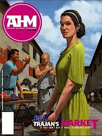
Take, for example, the design of our cover, which presupposes a decision about the magazine’s design in general. You will probably have noticed the big purplish logo at the top, which introduces a color – the printer calls it “magenta” – that will return in the magazine itself and on the website you are currently looking at.
But why magenta? One reason is that we think it is a cliché to present the world of Antiquity with stylistic means derived from that same age. Let’s face it: terra shades and the colors of natural dyes have been used too often. When we noticed how modern museums use bright colors, we realized that it might work for a magazine as well. Having made that decision, we also considered using an even brighter, more reddish shade, which might attract more attention when the magazine is on the shelves of a bookshop, or using a darker color, which would radiate more warmth.
Other decisions had already been made for us. The elder sisters of the new magazine, Ancient Warfare and Medieval Warfare, have original artwork on the cover, so it seemed logical to use nice drawings for Ancient History Magazine as well. Still, I have proposed to use nice photos of ancient objects, which have a beauty of their own, but my colleagues Josho and Jasper immediately reminded me that Ancient History Magazine is not about art history or archaeology, but about ancient society. Drawings are the only way to show what the world, back then, really looked like. Of course they were right.
We decided to have a scene from Trajan Markets on the cover, to illustrate the longest article in this trial issue. Making the drawing is, of course, the work of one artist: Miłek Jakubiec. Still, other people are involved too. Miłek first sent us some sketches and once we had decided which one we would use, he started to convert it into the drawing you see. Joe Hall, the author of the article on Trajan’s Markets, had some comments; Josho and I commented too; and Miłek patiently changed the drawing accordingly.
Because the orange dress he had originally chosen might be regarded as a color worn by prostitutes, it soon became green. This, however, changed the balance of the illustration: we needed something yellow, and therefore, you can see lemons being sold. A fresco from Frascati is evidence that the Romans knew lemons, and we know they were quite rare: fitting to be sold in Trajan’s Markets.
Finally, I must mention Katleen Vandenbranden, who was invited to look at the dress, and immediately proposed some changes: we hadn’t realized that our lady, who is supposed to live somewhere in the second century AD, wore a dress that was from the second century BC. It’s a detail, of course, but it nicely illustrates why the world of Antiquity is such a nice subject: whatever you are interested in, there’s always something unexpected around the corner, just waiting to be discovered.

