The look of the ancient world on screen
Ridley Scott’s Gladiator (2000) was a watershed moment in recent movie history. As Alastair Blanshard and Kim Shahabudin put in their Classics on Screen: Ancient Greece and Rome on Film (2011), it ‘came the first successful ancient world epic film to be released for over thirty years, to the surprise of both film critics and students of the ancient world’ (p. 216).
Since then,we’ve had a steady stream of movies set in the ancient world, and I’ve reviewed quite a few of them on this very blog, including Hercules, The Legend of Hercules, Clash of the Titans (a reboot of the 1981 original), Wrath of the Titans, Immortals, and – of course – 300. There have also been a few TV shows set in the ancient world, such as HBO’s Rome, and I recently reviewed Spartacus: Blood & Sand as well as the subsequent seasons of that series.
It’s safe to say that the ancient world epic, whether on the small screen or the big, is here to stay. But what’s particularly striking about all of the stuff that has been released lately is how coherent it is from a visual point of view. Most of these productions feature this golden sheen as far as the cinematography is concerned, where human skin resembles bronze rather than flesh, with dark shadows, and vivid reds. This palette, alternated with night-time or winter hues featuring good use of the colour blue, has become de rigeur for movies set in the ancient world.
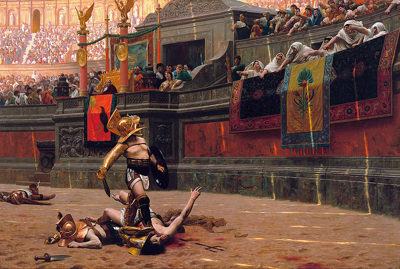
This particular look was first established in Gladiator, though the effect was relatively subdued – compared to something like 300 or Immortals, Gladiator seems less monochrome or ‘tonal’ in how colours are used. In his take on Roman gladiatorial combat, Ridley Scott was heavily influenced by the art of French painter Jean-Léon Gerôme (1824–1904), and his painting Pollice verso (‘turned thumb’) in particular:

This painting solidified the idea that the sign that the Romans made to order the death of a defeated combatant in the arena was the down-turned thumb, but this is far from clear. There have been lots of interesting discussions on which way the thumb had to be turned to signify either life or death. My Latin teacher back in high school claimed that thumbs up meant ‘weapons up and strike’ (i.e. death), whereas thumbs down meant ‘weapons down’ (i.e. live). Gerôme interpreted thumbs down as the kill order and it has stuck with us ever since.
In any event, it’s clear that not just this painting, but Gerôme’s work in general, has had a tremendous influence on film makers. In one of the episodes of the first season of Spartacus, there’s a view down a street where we see a few young women leaning against a wall, one of whom is entirely naked. This resembles a famous painting by Gerôme called ‘The slave for sale’:

Gerôme’s art is nowadays classified as Academicism, a sort of mixture of Neoclassicism and – unsprisingly – Romanticism. Like many Romantic artists, Gerôme had a deep love for the exotic, and Orientalism in particular, hence his fondness for depicting naked women in subtly erotic fashion and his attention to detail when it came to historical and mythological depictions. Other arists who were more or less Gerôme’s contemporaries and who created similar works include Domenico Morelli, Alexander Ivanov, Edward Poynter, Jean-Paul Laurens, and many others.
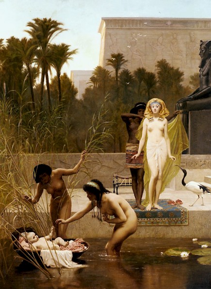
Here, for example, picked more or less at random, is a painting by Fredrick Goodall (1822–1904) entitled ‘The Finding of Moses’ (1862):

Paintings like these served as an inspiration not just for Ridley Scott and later film makers, but obviously too for films made in the 1960s and before. The main difference is that digital colour correction enables modern movie makers to exercise far greater control over the look of their films, allowing 300 or Spartacus or Immortals to look like a painting come to live, with digital skies the colour of caramel and digital blood spurts and slo-mo effects increasing the artistic impression of the sequences on display.
For centuries, the only way to get an idea of what the ancient world might have looked like was to look at paintings by renowned artists. But their artwork is glamourized and romanticized, and historical details often suffer. While Gerôme was credited, back in the day, for putting a lot of research into his paintings, it’s important to realize that our current state of knowledge has advanced quite significantly. Nineteenth-century paintings should be valued for their own intrinsic artistic merits and should not necessarily be taken as good representations of the past. They are, like all art, not objective, but subjective representations of an often idealized situation.

